CPAP Data Interpretation
Contents
Contents
Introduction
- This article and associated pages discuss the interpretation of data created by CPAP machines (of all types) and viewed using suitable software. Although the principles are software-independent, for convenience we will base the discussion on OSCAR. However much of what is discussed in these pages will also apply to ResScan, Encore, Prisma TS and other apnea software.
- For details of the OSCAR program, see OSCAR Help.
- Acknowledgement: Much of the material in this help system has been taken and/or adapted from RobySue's Beginner's Guide to SleepyHead
Events – Apnea, Hypopnea etc
Event flag graph and events table
Events such as apneas, hypopneas, large leaks and other are shown in three ways in OSCAR:
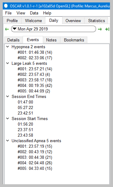
- The events table is accessed via the Events tab in the left side bar of the Daily page. It will list every occurrence of an apnea and other events, together with the time they occurred and the duration in seconds. The various sub-headings can be expanded. Click on any event to go to that same event in the graphs.
- The Events graph is normally the top-most graph on the Daily page, and shows each event as a vertical stroke. When zooming in on the other graphs, the Events graph will remain as is, with the zoomed in part of the night highlighted on the events graph. So it also provides a useful reference tool for being able to quickly put the zoomed in graphs into the context of the whole night.
- Events can also be shown on the Flow Rate graph and other graphs.
- The event index (ie number per hour) is shown in the left sidebar.

|
 |
The Event graph---a detailed look
The Event graph gives a snapshot of how good or bad the whole night was, and whether certain parts of the night were much uglier than the overall AHI might indicate. Compare these two event charts:
You don't need the actual AHI numbers to see that the first night was a lot worse than the second. On the second night, there are only three "events" scored all night: Two CAs and one H. There are a few flow limitations, but even the FL are well spaced. And the bit of snoring at the beginning of the night is not a real issue. Overall, this night's efficacy data is really quite good.
But on the first night, there are a lot more tick marks over all AND between 4:15 and 5:30 there are a lot of OAs, Hs, and CAs scored. There's a second smaller cluster of events around 8:30 as well. The other thing we can immediately see about the first night is that outside of the 4:15-5:30 and 8:30-9:00 time frames, the rest of the night was pretty good.
The Event graph tells us where to look if we want (a lot) more information about periods with "bad night-time breathing." On the top night's data, it's worth zooming in on the 4:15-5:30 to see just how ugly things are. When we zoom in on the daily graphs, the Event graph remains fixed, but the zoomed in time frame is highlighted as shown:

The highlighting on the Event graph gives a quick visual reference of where the zoomed in data comes from. That's useful if you start scrolling through zoomed in Flow Rate data for a whole night and notice something of interest. In other words, the Event Table serves as a "navigation" tool when you are looking at zoomed in detailed data.
When posting screen shots of zoomed in daily data, it is useful to include the Events graph in the screen shot so the others can get a sense of how the selected detailed data fits into the night as a whole.
Flow rate graph
Beyond AHI: Apneas and hypopneas in the flow rate graph
Snoring
Flow limitations
Machine reaction to events
Pressure
Leaks
- OSCAR leaks
- Leak Rate Graph: A closer look
Other parameters

Donate to Apnea Board


