Difference between revisions of "OSCAR Organization - Overview Page"
(→Key items on Overview page) |
(→Session times chart) |
||
| Line 35: | Line 35: | ||
===Session times chart=== | ===Session times chart=== | ||
Gives a graphical representation of the time when the machine was turned on then off. If you sleep all night long the bar will be solid. If you have one or more breaks the bar will likewise have breaks in it. | Gives a graphical representation of the time when the machine was turned on then off. If you sleep all night long the bar will be solid. If you have one or more breaks the bar will likewise have breaks in it. | ||
| + | |||
| + | A session times chart with multiple breaks in the bars indicates the patient is having disrupted sleep and is either not toleratin g CPAP treatment or else has other medical problems which are disrupting sleep. | ||
| + | |||
| + | ===Pressure chart=== | ||
| + | [[File:OSCAR Overview Pressure.png]] | ||
| + | |||
| + | The pressure chart indicates your maximum and minimum set pressures as well as the actual pressures (minimum, median, 95% and maximum actually experienced through the night. A more sophisticated machine such as a bilevel or ASV will have multiple colours, indicating different pressures for EPAP, IPAP and so forth. Again, resting the cursor over a bar will bring up a balloon with the relevant details. | ||
| + | |||
| + | ===Total time in apnea chart=== | ||
| + | As the name suggests, this is a simple measure of the total time spent in apneas during the night. | ||
| + | |||
| + | ===Flow limitation chart=== | ||
| + | Indicates flow limitations - a narrowing of the airways which does not qualify as an apnea or hypopnea. Resmed machines score flow limitations on a scale from zero to one.. | ||
| + | |||
| + | ==Leak rate and large leak charts=== | ||
| + | The leak rate chart shows leaks in L/min. The chart uses shades or colour to differentiate minimum, median, 95% and peak leaks. | ||
| + | |||
| + | The large leak chart shows the percentage of time the leak rate was above the "red line" threshold. | ||
| + | |||
| + | ===Tidal volume, Minute vent and Respiration Rate charts. | ||
| + | These charts all show the minimum, median, 95% and peak for each of the relevant parameters. | ||
| + | |||
| + | For a discussion of these parameters see [[]]. | ||
| + | |||
| + | ===Periodic breathing=== | ||
| + | This chart shows the percentage of each night during which periodic breathing occurred. High numbers and/or an upward trend could indicate respiratory or heart problems and should be referred to your doctor. Low numbers and occasional incidences can usually be ignored. | ||
Revision as of 08:24, 14 June 2019
|
Afrikaans /
في الصفحة /
български /
中国 /
臺灣 /
čeština/
Dansk /
Deutsch /
Ελληνικά /
Español /
Filipino /
Français /
עברית /
Magyar /
Italiano /
日本語 /
한국어 /
Nederlands /
Norsk /
Polskie /
Português /
Română /
Pусский /
Suomalainen /
Svenska /
ภาษาไทย /
Türkçe |
Contents
Introduction
This article is part of the suite of OSCAR help articles. See OSCAR Help.
Back to Basic OSCAR Organisation
This page explains in detail the OSCAR Overview page.
The Overview page gives a view of the main treatment parameters over a period of time. This is useful for spotting trends (eg AHI is getting progressively worse) which are not always apparent in the [Daily page]. It can be set to show a time span from one week to one year to "everything".
Select the Overview page from the menu View | Overview, The Overview tab, the Overview icon in the right sidebar, or by pressing <F6>.
Key items on Overview page

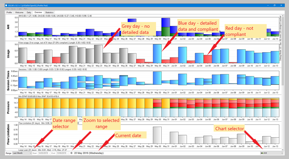
The Overview page shows the charts as a histogram (bar graph) where every bar represents one day of data. Select which chart you want included by using the 'Chart selector pop-up menu.
Select which dates you want to include by clicking on the Date range selector. The date ranges span from one week to one year. In addition, you can select "Everything" or else specify a range by selecting "Custom". Note that if you have several years of data it can take a few minutes for the chart to be calculated - in this time Oscar doesn't appear to be doing anything, but just be patient and it will eventually show the chart.
Chart interpretation
AHI chart
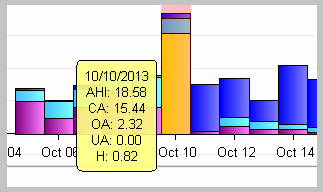
This chart shows the AHI each day, with different colours depicting different types of events (ie hypopnea, obstructive apnea, central apnea, unclassified apnea).
If you place your mouse cursor over the bar for a given day, a small "balloon" will pop up giving the date and the numerical breakdown of the event types.
Usage chart
The Usage chart shows how many hours per day your machine was used. The bars are colour-coded as follows: Red: Hours less than required for compliance. This is normally 4 hours per night but can be adjusted in File | Preferences | CPAP. Blue: Hours in excess of compliance, with full data. Grey: Hours more than compliance, but only summary data. This might be seen if you left the SD card out of the machine. On older machines such as the Resmed S9 series, a grey day can occur if the card hasn't been downloaded for over a week and the detailed data is over-written.
Session times chart
Gives a graphical representation of the time when the machine was turned on then off. If you sleep all night long the bar will be solid. If you have one or more breaks the bar will likewise have breaks in it.
A session times chart with multiple breaks in the bars indicates the patient is having disrupted sleep and is either not toleratin g CPAP treatment or else has other medical problems which are disrupting sleep.
Pressure chart
The pressure chart indicates your maximum and minimum set pressures as well as the actual pressures (minimum, median, 95% and maximum actually experienced through the night. A more sophisticated machine such as a bilevel or ASV will have multiple colours, indicating different pressures for EPAP, IPAP and so forth. Again, resting the cursor over a bar will bring up a balloon with the relevant details.
Total time in apnea chart
As the name suggests, this is a simple measure of the total time spent in apneas during the night.
Flow limitation chart
Indicates flow limitations - a narrowing of the airways which does not qualify as an apnea or hypopnea. Resmed machines score flow limitations on a scale from zero to one..
Leak rate and large leak charts=
The leak rate chart shows leaks in L/min. The chart uses shades or colour to differentiate minimum, median, 95% and peak leaks.
The large leak chart shows the percentage of time the leak rate was above the "red line" threshold.
===Tidal volume, Minute vent and Respiration Rate charts. These charts all show the minimum, median, 95% and peak for each of the relevant parameters.
For a discussion of these parameters see [[]].
Periodic breathing
This chart shows the percentage of each night during which periodic breathing occurred. High numbers and/or an upward trend could indicate respiratory or heart problems and should be referred to your doctor. Low numbers and occasional incidences can usually be ignored.

Donate to Apnea Board

