Difference between revisions of "OSCAR - The Guide"
(→Daily (Advanced Charts)) |
(→Daily (Other Charts)) |
||
| Line 291: | Line 291: | ||
===Resp. Rate=== | ===Resp. Rate=== | ||
| − | + | ==Daily (Other Charts)== | |
| − | + | ===AHI=== | |
| − | + | ===Time at Pressure=== | |
Revision as of 16:42, 3 March 2021
|
Afrikaans /
في الصفحة /
български /
中国 /
臺灣 /
čeština/
Dansk /
Deutsch /
Ελληνικά /
Español /
Filipino /
Français /
עברית /
Magyar /
Italiano /
日本語 /
한국어 /
Nederlands /
Norsk /
Polskie /
Português /
Română /
Pусский /
Suomalainen /
Svenska /
ภาษาไทย /
Türkçe |
Contents
- 1 OSCAR - the Open Source CPAP Analysis Reporter
- 2 Common features of detailed graphs
- 3 Daily (Standard Charts)
- 4 Daily (Advanced Charts)
- 5 Daily (Other Charts)
OSCAR - the Open Source CPAP Analysis Reporter
OSCAR is software that is compatible with Windows, Mac, and Linux operating systems, developed for reviewing and exploring data produced by supported CPAP, bilevel, ventilators, and related machines used in the treatment of sleep apnea. Oscar requires that data is collected on an SD card which MUST be inserted into the PAP machine during use to record detailed data.
Common features of detailed graphs
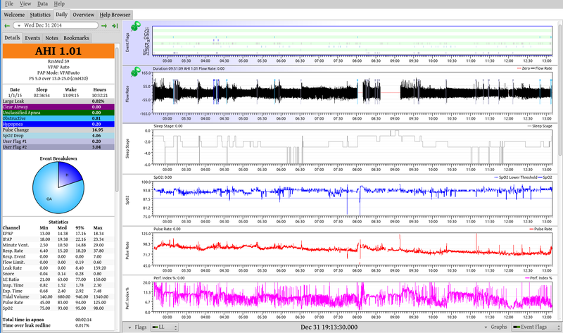
Left side-bar
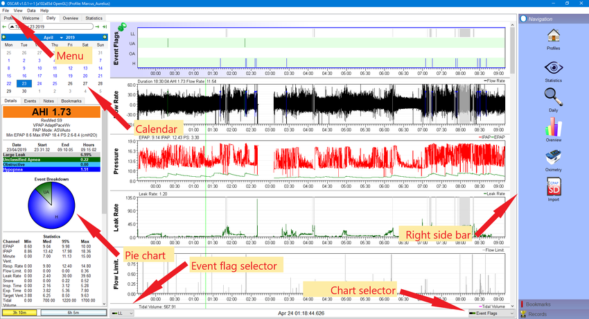
The Calendar
Pie Chart
Summary Information (AHI, Machine, Hours, Event rates)
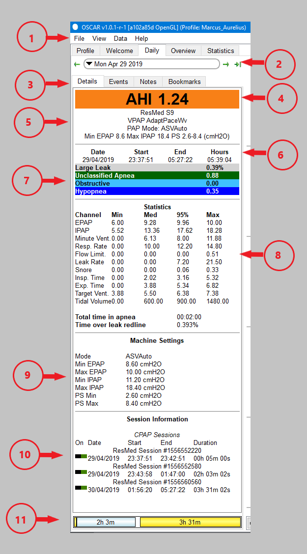
Items 4, 5, 6, and 7 in the side bar image are collectively the summary information. They show your apnea-hypopnea index (AHI), brief details of your machine and its settings, the time you slept, and the events which occurred during your sleep.
Note that the AHI shown is only for the 'sessions' which are turned on (see below). The summary of events will only show those which are turned on in the event flag selector. The available events will vary among different types of machine.
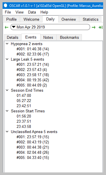
Tabs: Details, events, notes and bookmarks
|
Creating a bookmarkBookmarks are created using the [bookmark tab] on the daily page:
You can add text to a bookmark:
Reviewing bookmarksIn the [right sidebar] click on the Bookmarks button at the bottom of the sidebar. The sidebar will show a list of all the bookmarks which have been created. To go to a particular bookmark, click on the date. OSCAR will open the daily page at that particular date. You can then click on a bookmark and OSCAR will adjust the display to show the event which has been selected. You can search for particular text in your bookmarks using the search window at the top of the sidebar (under the word Bookmarks). Deleting bookmarksIn the Daily page, select the bookmark you wish to delete, then click "Remove Bookmark" at the bottom of the panel.
|
The daily detailed graphs
The main part of the daily page is given over to the detailed graphs. These allow you to inspect all the important things which happened during the night, right down to a breath-by-breath review.
Common features of detailed graphs
Each daily graph chart has a number of features in common:
- Turn graphs on or off: You can turn individual graphs on and off using the chart selector at the bottom right corner of the chart area. Click on the selector and a small menu will pop up, listing all the available graphs. Click on any one to turn it on or off. When turned on, the item will show a small green & black icon. If turned off, it will show a red and black icon. The available graphs will depend on your machine, and on settings in the preferences dialog.
- Zoom level: The default view shows the whole night's chart compressed onto a single panel. You can zoom in and out for a closer view as follows:
- Left click anywhere on a graph;
- Right click anywhere to zoom out;
- Place the cursor on a graph, hold the Ctrl button and rotate the scroll wheel;
- Use the keyboard Up Arrow to zoom in and the Down Arrow to zoom out;
- To zoom out to the full view you can also right click on any graph title and select "100% zoom level". Alternatively press and hold the Escape (Esc) key or Down Arrow on your keyboard for a couple of seconds.
- Time scale: Along the bottom of each graph is a time scale to show when events occurred.
- Pin chart in position: Double-click on the title of a graph to pin it in position. Once pinned, the graph will appear at the top of the screen and will not scroll with the other graphs.
- Resize chart: You can change the vertical height of any graph by clicking in the divider line and dragging it up or down.
- Pop out chart: Right click on the graph label and select "Popout graph". A copy of the graph will be created in its own window, which can them be placed anywhere on the screen. If you pop out more than one graph, they will share a common window.
- Clone graph: Right click on the graph label and select "Clone graph". A copy of the graph will be created below the original. The cloned graph can be zoomed independently of all other graphs. To remove the clone, right click on the title and select "Remove clone".
- Reset graph layout: If you have changed the vertical height of one or more graphs, double click on a graph title and select "Reset graph layout". All graphs will be restored to their normal height.
- Y Axis: If you want to change the vertical scale of a graph, right click in the label of a graph and select "Y axis". A small pop-up will show, and give the options Autofit, Defaults and Override. Select override, the adjust the minimum and maximum numbers until the trace on the graph is to your liking. Note that you must keep the mouse cursor within the pop-up - if it strays outside, the pop-up will disappear.
- CPAP overlays: Oscar can include a marker for each of the events on any of the graphs. Right click the graph title and select 'CPAP Overlays'. A pop-up will appear, allowing you to turn on or off each type of event. The events will appear as a short tick along the top of the graph.
- Oximeter overlays: If you have a pulse oximeter synched to Oscar you can display certain parameters using the oximeter overlay option.
- Dotted lines: Oscar will display dotted lines across a graph to aid in reading it. The available lines will vary depending on the particular graph. Right click on a graph title and select "Dotted lines". A pop-up will appear, with a list of available lines which you can turn on or off.
Daily (Standard Charts)
To reset the graph order for the Standard Charts click on View/Reset Graphs/Standard
Event Flags
The Event Flags graph normally appears at the top of the stack. It shows each event (Obstructive Apnea (OA), Cemtral Apnea/Clear Airway (CA), Hypopnea (H), Large Leak (LL), etc.) as a vertical bar. You can select which events to display using the event flag selector at the bottom left of the chart area. The available flags will vary depending on your machine. The graphical display of events is useful in determining whether they occurred at a particular time, in clusters or spaced throughout the night.
Each event type in the Event Flags graph will have a corresponding entry in the sidebar summary area.
First, Events only show if you have had them at some point, OSCAR remembers. If you have NEVER had a Clear Airway/Central Apnea event (CA) recorded, none will show. The same for RERAs (RE), though not all machines report RERAs. Second, if you have previously had an event type such as Clear Airway/Central Apnea event (CA) recorded, that category will always display even if you have none on the current night. The events shown here are all, alright, almost all, reported by your xPAP machine.
The exception: In the File/Preferences/CPAP tab there is a section for those of you that may want to experiment called Custom CPAP User Event Flagging. This allows you to define different Flow Restrictions and Event Durations
Issue - Positional Apnea
Positional Apnea is caused by misalignment of the airway typically tucking the chin down.
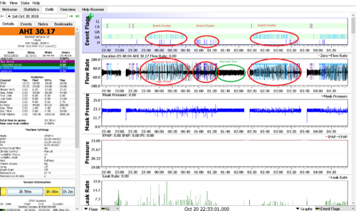
It is normally detected by clusters of Obstructive and Hypopnea events usually associated with an uneven and smaller/narrower Flow Rate chart.
see the Wiki article Optimizing_therapy#Positional_Apnea
Issue - Other
Correlation with other charts indicating cause and effect
Flow Rate
This graph is probably the most used in analyzing and interpreting CPAP data. It shows airflow in and out of your lungs throughout the night. The flow above the zero line is inhalation and below the line is exhalation. The events are shown on this graph as well as on the event flags graph. You can zoom in to examine an event more closely.
Placing the cursor on any event will create a small pop-up detailing the type and duration of the event in seconds.
Nearly all that is happening throughout the night can be seen in the Flow Rate graph though usually in a zoomed view. Tidal Volumes and Minute Vent can be seen via the 'volume under the curve', flow limits may show as "grassy" on the full night view but are readily apparent when viewed with the breath waveform is readily distinguished, typically 2-3 minutes. Leaks may sometimes be distinguished by a difference in volume between inhale and exhale. Periodic Breathing can be confirmed easily on this chart and serious breathing patterns such as CSR can be identified and Flow Limits become readily apparent.
Issue - Positional Apnea (Chin tucking)
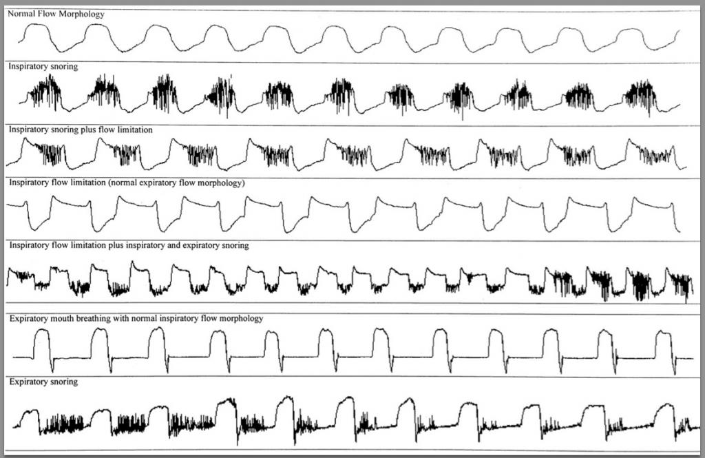
Issue - Various (Flow Limitation, Snoring, Mouth Breathing)
Issue - Preiodic Breathing (CSR, PB)
Note: ResMed (incorrectly) labels all periodic breathing as CSR. All Periodic Breathing should be viewed in a zoomed view to identify its properties.
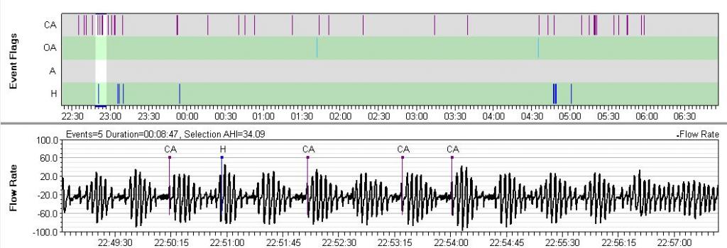
Philips Respironics machines flag breathing that meets their definition of periodic breathing (PB). On the Philips Respironics web pages PB is defined as, "Periodic breathing is defined as alternating periods of hyperventilation with waxing/waning tidal volume..." Typically the waxing and waning pattern must be quite regular in visual appearance and it must present for at least a minute or two for PB to be scored. PB is flagged with a green back ground on the flow rate data. Often, but not always, there will be CAs (or Hs or sometimes OAs) scored at the nadir of the cycle. Sometimes the System One will only flag the most obvious part of the cycle:

A bit of PB now and then is nothing to worry about. However, there is one form of PB that is called Cheyne-Stokes Respiration (CSR) that is clearly associated with some forms of heart disease, including congestive heart failure. CSR is very regular and has a CA at the nadir of the cycle (although the CA may be mis-scored as an OA). If you have serious heart disease and you see a lot of PB scored in your flow rate data, it is worth mentioning it to your cardiologist as well as your sleep doctor.
Detecting Periodic Breathing on other CPAPs
Once you know what PB looks like, you can often spot suspicious patterns by simply scrolling through the Flow Rate data in with a 5-10 minute window. Any periodic waxing/waning patterns will be show up at that magnitude. Whether this is worth doing on a regular basis is another question altogether. Unless you have a co-morbid condition that is associated with PB (such as congestive heart failure), PB is not something you need to spend much time worrying about or trying to locate in your data.
Here's an example of PB that may be CSR pulled from a ResMed machine:
Pressure
Pressure and Mask Pressure
The pressure graph shows the pressure as it varies over time. The mask pressure graph shows the pressure at the mask on a breath by breath basis.
Zooming in shows how the mask pressure is a high-resolution chart sampled 25 times per second, while the pressure is only sampled once per second. Depending on your machine settings there may be several traces shown - usually the inhale pressure (IPAP) and exhale pressure (EPAP).
Flow Limit.
ResMed: Flow Limits are calculated as an index, 0-1, indicating the flatness of the breath-form on the flow rate chart. Zero means none, severity increasing as the index approaches one. These show as a varying height vertical bar.
Flow Limits are the 'foundation' of obstructive events. The least severe of these events are flow limits followed by hypopnea and then obstructive apnea. They are often identified as a fundamental part of RERAs and UARS Note that on this graph flow limits are under-reported as compared to what we can visualize on the flow rate graph discussed above.
Flow Limits are often the main driver of pressure increases, especially with ResMed devices. Seeing Flow Limits in this graph is almost always accompanied by an increase in pressure as the ResMed algorithms depend heavily on the flow limits that are shown in this graph.
Leak Rate
The leak rate graph indicates whether excessive mask leaking occurred, and to what extent. All CPAP masks are designed to leak or vent surplus air away from the user's nose or mouth. This flushes away the exhaled breath and prevents the user re-breathing his expelled CO2. The actual amount of this designed leak will vary according to the mask. Anything in excess of that amount is "additional leak".
Resmed machines show a single trace indicating the additional leak. By default (in accordance with Resmed guidelines), Oscar flags any additional leak over 24 L/min as an excessive or "large leak". You can adjust the red line between acceptable and unacceptable leaks by using File | Preferences | CPAP | Flag leaks over threshold.
Philips machines show two traces - total leak and additional leak. It is the lower additional leak line which indicates whether the leak is excessive or not.

Leak graph from Resmed machine showing excessive leakage

Leak graph from Philips machine showing upper and lower traces
Snore
Resmed and Philips machines both show snoring as a graph with the height of the trace indicating the intensity of the snoring. In addition, Philips machines show individual snores as events labeled VS1 and VS2 (vibratory snore 1 and 2). It is usually suggested that VS2 be turned off when presenting screenshots for discussion as the large number of events recorded can overwhelm other data on the charts.

OSCAR snore graph from Resmed machine
Zeo Data
If data has been imported from a Zeo sleep monitor device, additional graphs will be available, including Sleep stage,
Daily (Advanced Charts)
To reset the graph order for the Advanced Charts click on View/Reset Graphs/Advanced
Event Flags, Flow Rate see Daily (Standard Charts) for description
Mask Pressure
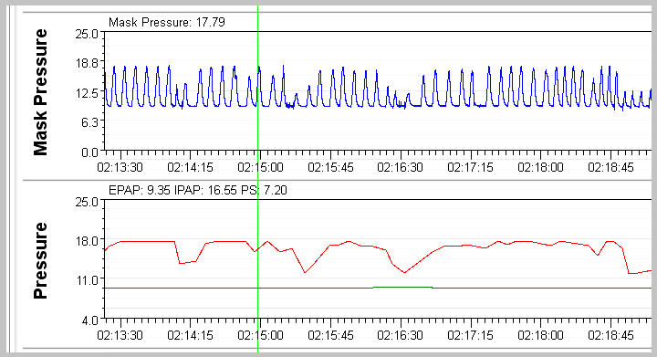
Mask Pressure is used in advanced cases such as for Central Apnea or other breathing issues where the breathing is paced (Timed) such as some cases of COPD. It lets us see how the pressure is being delivered.
ResMed ASV - Example
See the relationship between Pressure and Mask Pressure. The Pressure chart looks a little jointed, because of its resolution. I view it as the current target pressure. Here there are two plots, the top red one is IPAP or inhale pressure, the bottom green one is EPAP or Exhale pressure, the difference is the intended Pressure Support (or EPR with an AirSense)
Mask Pressure is the Pressure at the mask. It is recorded in much higher resolution than Pressure is.
In this example, you can see the shape of the pressure delivered by the Resmed ASV. Compare it to the square-wave which is what Philips gives, even with Flex at 3. Look how normal the resulting respiratory flow rate is. Midway through this graph is an obstructive UA event (we know it's obstructive because the Resmed doesn't miss a central). Note how quickly pressure hits the top of the PS setting when a breath is missed. It doesn't step up over 4-breaths, it comes in right away and backs off as soon as respiration is spontaneous. The Philips lags in both directions. As a result, the Resmed does not very often miss its minute vent target.
Tidal Volume
Minute Vent
Insp. Time
Exp. Time
Resp. Rate
Daily (Other Charts)
AHI
Time at Pressure

Donate to Apnea Board
