OSCAR Organization - Daily Page
|
Afrikaans /
في الصفحة /
български /
中国 /
臺灣 /
čeština/
Dansk /
Deutsch /
Ελληνικά /
Español /
Filipino /
Français /
עברית /
Magyar /
Italiano /
日本語 /
한국어 /
Nederlands /
Norsk /
Polskie /
Português /
Română /
Pусский /
Suomalainen /
Svenska /
ภาษาไทย /
Türkçe |
Introduction
- This guide is part of the suite of OSCAR help articles. See OSCAR Help.
- This page explains in detail the OSCAR Daily screen.
- Acknowledgement: Much of the material on this page has been sourced from [RobySue's Beginner's Guide to SleepyHead]
Left side-bar
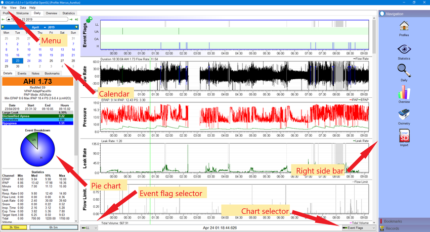
The Calendar
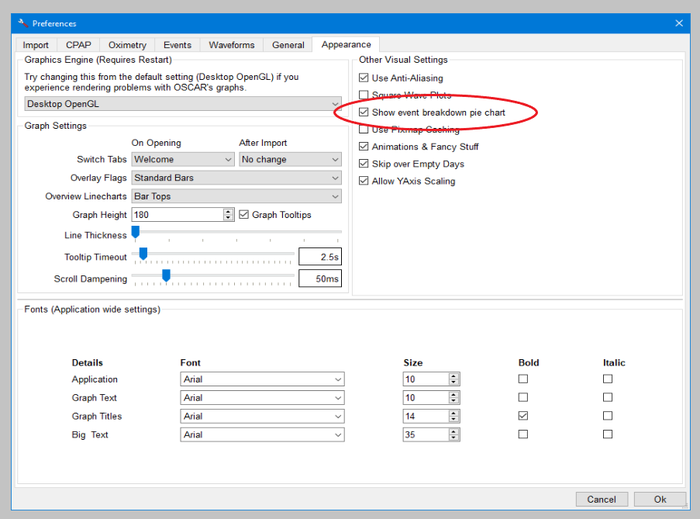
Pie Chart
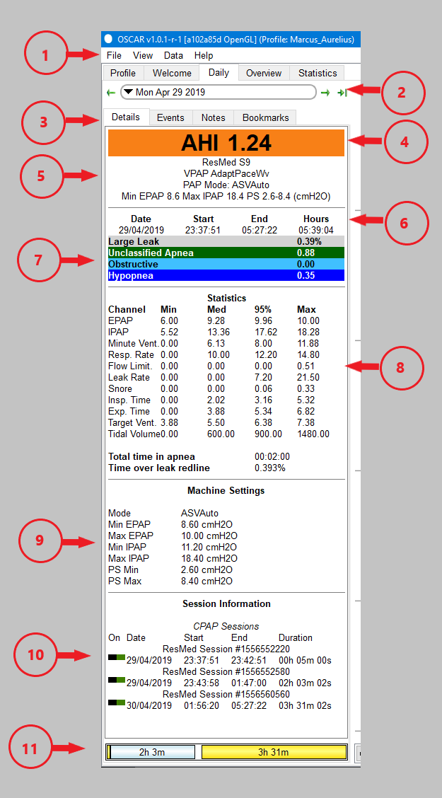
Summary Information (AHI, Machine, Hours, Event rates)
Items 4, 5, 6, and 7 in the side bar image are collectively the summary information. They show your apnea-hypopnea index (AHI), brief details of your machine and its settings, the time you slept, and the events which occurred during your sleep.
Note that the AHI shown is only for the 'sessions' which are turned on (see below). The summary of events will only show those which are turned on in the event flag selector. The available events will vary among different types of machine.
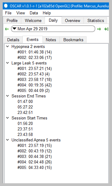
Tabs: Details, events, notes and bookmarks
|
|
Statistics
The statistics panel gives details of your pressures, minute ventilation, respiration rate and other important parameters. For each parameter (referred to as a 'channel') the panel shows the minimum recorded, the median, 95th percentile and the maximum.
Also shown are the total time in apnea, and the time over the leak redline. For Resmed machines this is 24 L/min. For all machines the redline number can be set in the menu File | Preferences | CPAP.
Machine settings
As expected, this panel tells you the pressure and other settings for your machine. The settings shown will vary according to the type of machine.
Session Information
Each time you turn the machine on, then off again is referred to as a 'session'. If you sleep all night without turning the machine off, that will be one session. If you turn it off once for a toilet break, that will show two sessions.
Clicking on the blue and yellow session buttons will include or exclude sessions from the display of the night's data. This can be useful if (for example) you had a very brief nap in the afternoon and want to exclude it from the night's results. Note that turning a session off will change the calculated AHI for the night. Note also that sessions can be turned on and off using the small green/black buttons in the section information panel. When a session is off the button changes to black / red.
The daily detailed graphs
The main part of the daily page is given over to the detailed graphs. These allow you to inspect all the important things which happened during the night, right down to a breath-by-breath review.
Common features of detailed graphs
Each daily graph chart has a number of features in common:
- Turn graphs on or off: You can turn individual graphs on and off using the chart selector at the bottom right corner of the chart area. Click on the selector and a small menu will pop up, listing all the available graphs. Click on any one to turn it on or off. When turned on, the item will show a small green & black icon. If turned off, it will show a red and black icon. The available graphs will depend on your machine, and on settings in the preferences dialog.
- Time scale: Along the bottom of each graph is a time scale to show when events occurred.
- Pin chart in position: Double-click on the title of a graph to pin it in position. Once pinned, the graph will appear at the top of the screen and will not scroll with the other graphs.
- Resize chart: You can change the vertical height of any graph by clicking in the divider line and dragging it up or down.
- Pop out chart: Right click on the graph label and select "Popout graph". A copy of the graph will be created in its own window, which can them be placed anywhere on the screen. If you pop out more than one graph, they will share a common window.
- Clone graph: Right click on the graph label and select "Clone graph". A copy of the graph will be created below the original. The cloned graph can be zoomed independently of all other graphs. To remove the clone, right click on the title and select "Remove clone".
- Zoom level: The default view shows the whole night's chart compressed onto a single panel. You can zoom in and out for a closer view as follows: 1) Left click anywhere on a graph; 2) Right click anywhere to zoom out; 3) Place the cursor on a graph, hold the Ctrl button and rotate the scroll wheel. To zoom out to the full view you can also right click on any graph title and select "100% zoom level".
- Reset graph layout: If you have changed the vertical height of one or more graphs, double click on a graph title and select "Reset graph layout". All graphs will be restored to their normal height.
- Y Axis: If you want to change the vertical scale of a graph, right click in the label of a graph and select "Y axis". A small pop-up will show, and give the options Autofit, Defaults and Override. Select override, the adjust the minimum and maximum numbers until the trace on the graph is to your liking. Note that you must keep the mouse cursor within the pop-up - if it strays outside, the pop-up will disappear.
- CPAP overlays: Oscar can include a marker for each of the events on any of the graphs. Right click the graph title and select 'CPAP Overlays'. A pop-up will appear, allowing you to turn on or off each type of event. The events will appear as a short tick along the top of the graph.
- Oximeter overlays: If you have a pulse oximeter synched to Oscar you can display certain parameters using the oximeter overlay option.
- Dotted lines: Oscar will display dotted lines across a graph to aid in reading it. The available lines will vary depending on the particular graph. Right click on a graph title and select "Dotted lines". A pop-up will appear, with a list of available lines which you can turn on or off.
Event Flags
The event flags graph normally appears at the top of the stack. It shows each event (apnea, hypopnea, large leak etc) as a vertical bar. You can select which events to display using the event flag selector at the bottom left of the chart area. The available flags will vary depending on your machine. The graphical display of events is useful in determining whether they occurred at a particular time, in clusters or spaced through the night.
Each event type in the event flags graph will have a corresponding entry in the side bar summary area.
Flow Rate
This graph is probably the most used in analysing and interpreting CPAP data. It shows airflow in and out of your lungs throughout the night. Flow above the zero line is inhalation and below the line is exhalation. The events are shown on this graph as well as on the event flags graph. You can zoom in to examine an event more closely. Placing the cursor on any event will create a small pop-up detailing the type and duration of the event.
Pressure and Mask Pressure
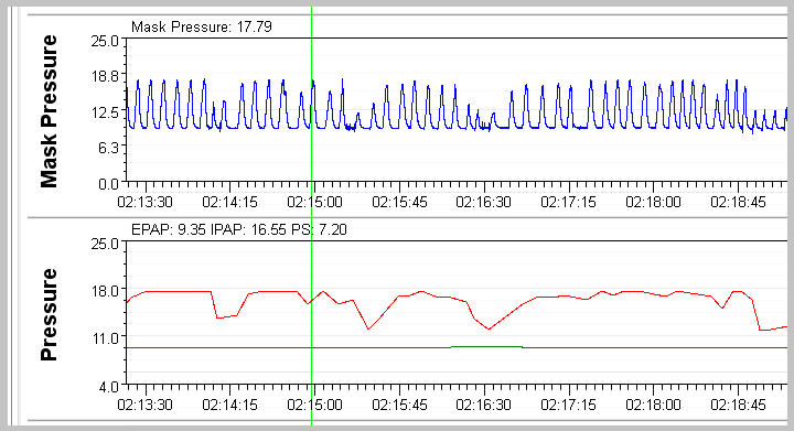
The pressure graph shows the pressure as it varies over time. The mask pressure graph shows the pressure at the mask on a breath by breath basis.
Zooming in shows how the mask pressure is a high resolution chart sampled 25 times per second, while the pressure is only sampled once per second. Depending on your machine settings there may be several traces shown - usually the pressure in inhale (IPAP) and on exhale (EPAP).
Flow Limitation
Leak Rate
Snore
These are the graphs that the experienced forum members keep referring to when they ask for more specific information about what your graphs look like.
Here's a close up of the top of the graphical data:
The top chart is the Events chart. The Events chart gives a snapshot of just how good or bad the night was. (This patient had a really good night on this night). In SleepyHead 0.9.5 and 0.9.6, this chart is pinned to the top of the detailed data graphs and it will NOT scroll out of view when you scroll down to look at more graphs. It's best to leave the Events chart pinned since it serves as a navigation guide: The Events chart does not zoom in with the rest of the graphs.
The Flow Rate graph is often called the wave flow data. When you zoom in on this graph you can see a trace of every breath you took all night long.
The labels on the rest of the graphs are self-explanatory once you know the jargon. This is discussed later in this article.
Scrolling down reveals additional daily data graphs:
The particular graphs that you will see in OSCAR depends on the machine you are using and whether you have turned any of the available graphs "off". This is discussed later in this article as well.

Donate to Apnea Board
