OSCAR Organization - Daily data window
|
Afrikaans /
في الصفحة /
български /
中国 /
臺灣 /
čeština/
Dansk /
Deutsch /
Ελληνικά /
Español /
Filipino /
Français /
עברית /
Magyar /
Italiano /
日本語 /
한국어 /
Nederlands /
Norsk /
Polskie /
Português /
Română /
Pусский /
Suomalainen /
Svenska /
ภาษาไทย /
Türkçe |
OSCAR Help
This guide is part of the suite of OSCAR help articles. See OSCAR Help.
Acknowledgement: Most of the material on this page has been sourced from [RobySue's Beginner's Guide to SleepyHead]
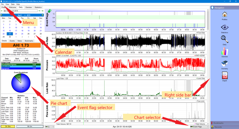
The Calendar
The calendar can be useful for navigation, but if you are posting a Sleepyhead Daily Detail graph on the forum, it should be minimized. To minimize the monthly calendar, just click on the triangle to the left of the current date. This is described in SleepyHead Chart Organization
If you click on a date in the calendar, the daily data for that date loads into the daily data window. It's also important to understand that the data for June 20, 2014 is the data for the NIGHT that started on June 20, 2014 and ended on the morning of June 21, 2014. And that's true regardless of whether you get to bed before midnight.
Now look at the little arrows in the calendar. The two arrows in green circles on the bar with the month's name allow you to navigate around the calendar without changing the data in the graphs. This makes it faster to get to a certain day you know you want to look at when it's not in the current "month". The two arrows that surround the bubble with the highlighted date for the daily data move one day backward or forward in data. The third outside arrow on the far right will immediately jump to the last date with data.
Pressing the downward triangle between the month and the year allows you to quickly change to a different month. Clicking the year allows you to quickly change to a different year. That helps if you need to jump to a date that is fairly far from the one you are currently looking at.
Pressing the upward facing arrow in the bubble with the the date in it will hide the calendar and change that triangle to a downward facing triangle. Clicking the downward facing triangle will unhide the calendar. Hiding the calendar is useful if you want more room for the Left Sidebar data.
The Left Sidebar
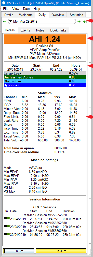
The Left Sidebar has both summary data and statistical data for the given date. Typically you need to scroll down to see all the data.
Here's a picture showing the Left Sidebar. Please read SleepyHead Chart Organization for tips on organizing the Left Sidebar without the pie chart or calendar for posting on the forum:
Tips on how to interpret all this data can be found in 4. Basic data interpretation: Daily Detailed Data. The organization of the Left Sidebar is what we're interested in here.
The top of the Left Sidebar is the summary efficacy data for the night. Below that is a pie chart that give the relative sizes of each of the major types of events scored by the machine. The pie chart can be turned off if preferred.
Below the pie chart is the statistical data for pressure, leaks, and respiratory data that may not be of much interest, particularly if you are just starting out.
Below the statistical data is some summary data about the machine's settings for the night and the session data. This data is from someone who typically turns the machine on, goes to sleep, and doesn't wake up until morning. For those with insomnia, session data is much more interesting.
The daily detailed graphs
These are the graphs that the experienced forum members keep referring to when they ask for more specific information about what your graphs look like.
Here's a close up of the top of the graphical data:
The top chart is the Events chart. The Events chart gives a snapshot of just how good or bad the night was. (This patient had a really good night on this night). In SleepyHead 0.9.5 and 0.9.6, this chart is pinned to the top of the detailed data graphs and it will NOT scroll out of view when you scroll down to look at more graphs. It's best to leave the Events chart pinned since it serves as a navigation guide: The Events chart does not zoom in with the rest of the graphs.
The Flow Rate graph is often called the wave flow data. When you zoom in on this graph you can see a trace of every breath you took all night long.
The labels on the rest of the graphs are self-explanatory once you know the jargon. This is discussed later in this article.
Scrolling down reveals additional daily data graphs:
The particular graphs that you will see in OSCAR depends on the machine you are using and whether you have turned any of the available graphs "off". This is discussed later in this article as well.

Donate to Apnea Board


